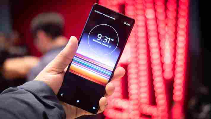
Xperia 1 and 10 hands-on: Sony makes the case for super-tall phones
It’s been a long time since Sony was a leader in the mobile industry – certainly not after the rise of Android and iOS. In the years since it’s delivered some decent handsets under the Xperia family, but few that have truly stood out in an increasingly crowded market.

But now Sony is looking for a fresh start, rebooting its phone series with the Xperia 1 and 10 – its new flagship and midrange devices, respectively. Their headlining feature is a 21:9 display that is taller than pretty much anything else out there. That’s one way to stand out, I guess.
There are a few benefits to this design. The most obvious one is that, flipped into landscape mode, the display’s 21:9 aspect ratio is very near the 2.35:1 and 2.39:1 formats so common in movies. No letterboxing, and very little cropping – although you then run into pillarboxing while watching regular 16:9 content. Still, considering Sony‘s stake in the film business, it’s something of a sensible move.


As with desktops, the ultrawide/tall format helps multitasking too. Most smartphones need to be used in landscape mode to use split-screen comfortably. On the Xperia 1, staying vertical should be just fine.
Lastly, a taller aspect ratio means a thinner phone, which makes it a little easier to grip. I could see myself getting used to the taller design; though it means the notification shade is way up high, the phones are indeed a little more comfortable to hold than other phones with similar display sizes.
That said, it’s worth noting that display size is misleading with a narrower phone. Though the Xperia 1 has a 6.5-inch display diagonal, it’s smaller than other 6.5-inch phones due to the narrower aspect ratio.
Tall display aside, the Xperia 1 and 10 aren’t as radical departures from their predecessors as the naming scheme might make you think.
They still have that boxy design Sony is known for, and the specs are about what you’d expect in their given categories. The Xperia 1 comes with a 6.5-inch OLED panel, a Snapdragon 855, 6GB of RAM, and 128 GB of storage. The Xperia 10 comes with a 6-inch LCD, a Snapdragon 630, 3GB of RAM, and 64 GB of storage. A ‘Plus’ variant sports a 6.5-inch display with 4GB of RAM.
The Xperia 1 also comes with the triple-camera system we’re quickly seeing become the norm: a wide, ultrawide, and telephoto arrangement. Sony says it’s taking the camera more seriously this time around, bringing key people from its digital imaging group – the folks who make the excellent Sony Alpha cameras – onto the Xperia team.
The company already teased a few improvements borrowed from its mirrorless cameras, including the ability to track not just faces, but the closest eye of your subject for perfect focus. The camera is also able to shoot at 24fps, includes noise reduction at the RAW image level, and sports eight professional-looking color-grading modes.
The Xperia 1 isn’t reinventing the wheel, but it’s encouraging to see Sony enter this year’s smartphone race with renewed vigor. While the proof is in the pudding, I’m glad to see the company is finally leveraging more know-how from its professional camera team, and the tall aspect ratio is at the very least something different.
Of course, I’ll have to spend more time with the devices to know if they’re worth you’re money. The Xperia 10 and 10 Plus land March 18 for $350 and $430, respectively. The Xperia 1 arrives in late spring, but no pricing has been announced.
